DX NetOps

 View Only
  • 1.  CA PC graph colors

    Posted Feb 24, 2016 06:38 AM

    Hi,

    I have few questions regarding colors on CA PC graphs.


    Untitled.png

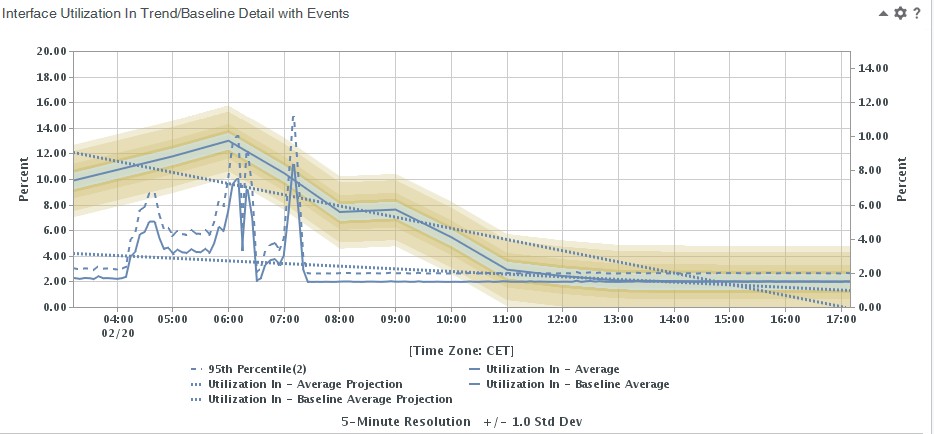
    What those different colors around baseline mean? I suppose it is standard deviation, but why it changes color the further it is from the base line.


    Is it possible to change the color in graphs? For example in here- baseline and actual utilization are the same color (it is not very easy to differentiate if baseline and actual data are close to each other). And if there is multiple utilization curves in graph CA PC gives colors randomly, is it possible somehow to change it?


  • 2.  Re: CA PC graph colors
    Best Answer

    Broadcom Employee
    Posted Mar 06, 2016 08:25 AM

    We support minimal UI changes.  For example, changing the logo, background color, view title bar text, color  of the group filter text, color of the dashboard name - but i do not see anything, anywhere about changing about changing the graph colors.  You could log that on the idea wall as an enhancement.  Just in a more broad sense, it could read,  that you would want more flexibility to customize the tool to meet your needs


  • 3.  Re: CA PC graph colors

    Posted Mar 07, 2016 02:54 PM

    There is an existing idea that I believe covers this:   Customizable Color Pallete    It doesn't seem to be moving in a hurry, though.