Many of our users have discovered the power of using the Custom Chart app in the app catalog, and morky01 has added some new functionality to make it even more awesome! For those of you that haven't tried out Custom Chart, this is a powerful app that allows you to display and export data in many ways with options to create several chart types on a variety of work items.

Where To Find It
Custom Chart is part of the Community App Catalog, which means it will show up in the app catalog if your subscription admin has enabled the Community App Catalog.
If you don't have the Community App Catalog enabled, sub admins can also add this to their Subscription App Catalog to make it available to everyone in their subscription.
Without having it in the Community App Catalog or adding it to the Subscription App Catalog, you can still add a Custom HTML app to your custom page and copy the source for Custom Chart into it.
How To Use It
Once you've created a custom page and added this app to it, you can use the gear icon in the top right of the app to select Edit
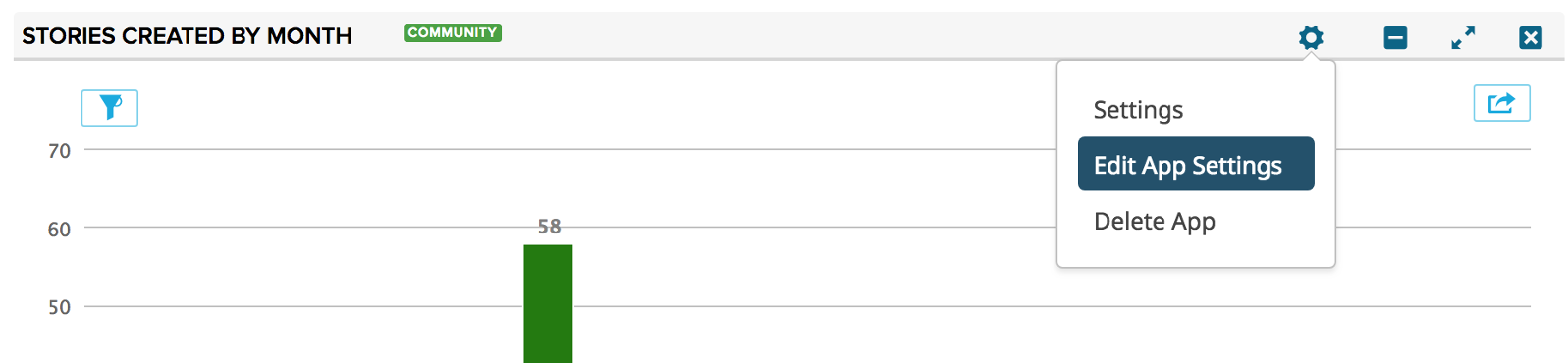
The app settings will let you decide everything from the chart type to the work item type to display, the field to aggregate on, and
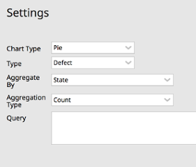
Some cool things that you could do with a Custom Chart are:
- View your defects by resolution to determine how many require code changes versus user education.
- View your stories by estimate to see if story sizes are generally too big or too small which would indicate the team should recalibrate their sizing.
- View your features by investment category, aggregated by story leaf plan estimate to assess how you’re spending your time across your portfolio and adjust accordingly.
New Functionality
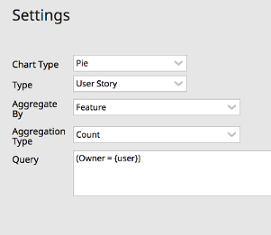
Setting Owner To Current User
To make the data seen by each user more personal, you can set the Owner to {user} for a custom chart on a shared page. This will make it so each person viewing the page will see data specific to them. For example, you could update the settings on your Custom Chart to show the stories that each person owns aggregated by feature:
New Aggregation For Dates
Another new feature is the ability to aggregate data on Custom Chart for different date increments. If you set the Aggregate By to any date field, you'll see new Bucket By options.

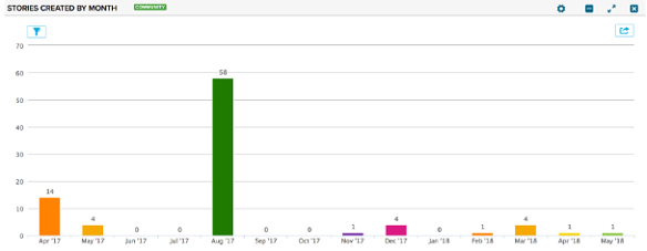
With these new options, you can create all sorts of date-based chart, like this one that shows number of stories created by month:
Support for Risks
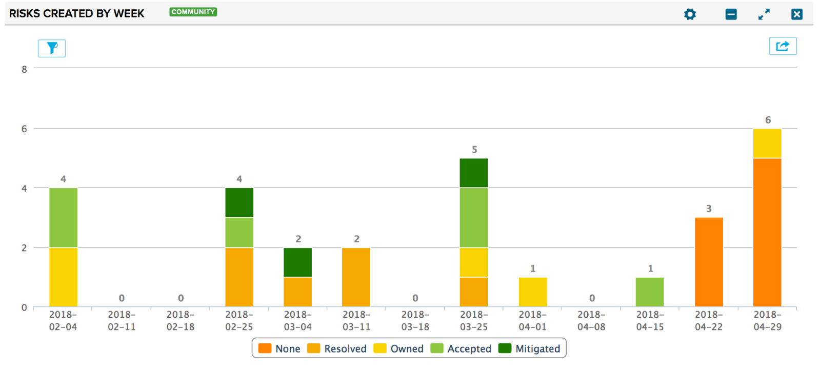
If you are participating in the risk work item beta, you can now use the Custom Chart app to view data about your risks. For example, you can create a column chart to track risk creation by week stacked by response:
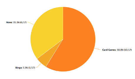
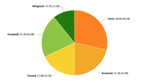
Improved Labels on Pie Charts
In addition to the category and percentage on pie charts, we've added a count to the pie chart labels and tooltips, which should make it easier to get all of the information you need.
Feedback?
If you have any feedback about this app or any others, please feel free to add a comment to this Community post!