Rally Software

 View Only
Expand all | Collapse all

Save Collections formatting

  • 1.  Save Collections formatting

    Posted Dec 13, 2018 12:59 PM

    I've searched but cannot find any way to do this, so am submitting this for an enhancement.


    The new Collections page is great!  I use it all the time, well, I would like to use it all the time but the thing that limits me the most is the fact that most of the time I have to re-align the columns so that I can actually read the text in the Name field.  This happens a lot when looking at Tasks.


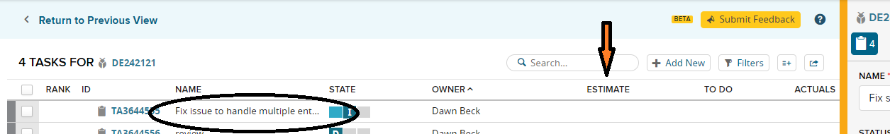
    As seen in the screenshot, the default view for this gives a ton of width to columns that don't need it.  Like the Estimate column (which would generally be less than 3 chars wide.  Same for all the hours fields (To Do, Actuals).  Also, the Owner column is much longer than would need to be practically, considering the column is much wider than most names would fill, and you probably know all the members on your project, so would be able to recognize the person with probably the first 15 chars yet it looks like ~25 chars are assigned to this field.  Even the State field, which cannot exceed the 3 options of D/I/C is allotted a huge amount of blank space. 


    All this forces the Name field to be truncated in most instances.  So I have to drag my column widths in order to see the full (or at least more of the) text so that I understand what the work item is.  So, this is not a biggie, but I have to do it over, and over and over and over (well, you the idea) again.  Seems like the width percentages should be saveable in a user setting so that I don't have to re-invent this wheel.  Multiple times a day....


    Even if this wasn't updated to save a user's formatting preference, could we at least have it fixed so that certain column widths don't exceed the width of the header (like Estimate, To Do and Actuals).  It's such wasted space on the Collections screen and wasted time for me to reformat it over and over.


  • 2.  Re: Save Collections formatting

    Posted Dec 13, 2018 01:20 PM

    I should have mentioned, I believe I have already customized the fields to be displayed in the Collections page to only show the most relevant fields.  And the space issue is STILL an issue for the Name field.


  • 3.  Re: Save Collections formatting

    Posted Dec 14, 2018 07:07 AM

    This is an absolute bane in many of the so-called new improved screens.


    Especially the way your changes are not saved even for the duration of the browser session, and the unhelpful defaults are reimposed numerous times a day.  Including whenever you click through the QDP into Collections, complete a change and come back again to find the original main page you were working from all re-widthed again.


    Quality Management is not yet better than the dusty, creaky old Test Plan screen for this exact reason.


  • 4.  Re: Save Collections formatting

    Posted Dec 14, 2018 01:29 PM

    I would agree.  Though there are some definite benefits to most of the new screens, it's almost like they were deployed a bit too early, before they were completely thought out.  I know deep in my bones that others have complained about similar, yet if they were not prepared to make quick and responsive updates why torture us with a half implemented feature?


    For example, on the Team Planning page, in Planning View, you cannot adjust ANYTHING horizontally (other than switching between Backlog, Planning and Planned View), often making most of the important information unusable.  Unless you have a very large monitor, most of the time I cannot read enough of the Name field to know what US/DE it is.  So when someone is presenting in a meeting from their laptop, it's a guessing game to know what item they're presenting or talking about.  Why, for example, does the Tasks column have so much width assigned to it?  Same for Schedule State...there is a fixed width of labels for those fields yet they are allotted so much space the Name field gets truncated.  One wonders if the developers, who probably have VERY large monitors to work with, don't take the time to work with their product in different manners to see how they affect average users.


    I could go on, but then I'll start to get even more frustrated....


  • 5.  Re: Save Collections formatting
    Best Answer

    Broadcom Employee
    Posted Dec 14, 2018 05:30 PM

    grama23 do you know if we have an idea submitted for this?  I searched but didn't see it.


  • 6.  Re: Save Collections formatting

    Posted Dec 14, 2018 05:58 PM

    Well, drats!  That's what I thought I submitted here.  Argh....these CA links are really tough to navigate, and you never know where you are.  I can repost if you have a WORKING link to the ideas site?


  • 7.  Re: Save Collections formatting

    Broadcom Employee
    Posted Dec 14, 2018 06:27 PM

    I haven't seen an idea for this yet KimAbbott1357028 so thank you for submitting it!


  • 8.  Re: Save Collections formatting

    Posted Dec 14, 2018 06:37 PM

    Don't forget to vote for it!  :-)


  • 9.  Re: Save Collections formatting

    Posted Dec 14, 2018 06:10 PM

    I seriously started with the ideas url, but after logging in it sent me here, so without looking too closely didn't notice I wasn't at the ideas portal anymore.


    Anyhow, created idea https://ideas.rallydev.com/ideas/D4852 if you want to go vote for it - thanks for the heads up.


  • 10.  Re: Save Collections formatting

    Posted Dec 20, 2018 04:05 PM

    Thank you for taking the time to write this up!   Added my chip!


  • 11.  Re: Save Collections formatting

    Posted Dec 20, 2018 09:22 AM

    I voted for the idea but wanted to add my full agreement here as well.  Column layouts on all of the new screens (collections pages and work views) behave strangely.  In addition to not saving previous column widths, when adding a new column everything is completely thrown off.  A perfect example is a work view with columns like names and parents,  laid out in a nice format so everything is readable.  When I add something that requires very little space like Discussions or Dependencies, everything is squished to the left and I get really wide new columns.  I don't expect it to lay everything out perfectly, but it seems like columns that show only one or two digits (e.g. Plan Est) or a count (e.g. Risk, Discussions, Dependencies) should default to a narrower width.


    The other thing I'm noticing a lot more as I use QDPs and Collections pages is that if you close things in the wrong order you get stuck in a loop and have to just navigate to a page to get out of it.  Does anyone else see that?


    Overall I love the new experience, these are just things that make it definitely feel 'unfinished' or not quite there.  Keep the good stuff coming!


  • 12.  Re: Save Collections formatting

    Posted Dec 20, 2018 04:11 PM

    I am seeing the looping as well and while I am trying to back out slowly, I still end up in it every now and then.  Thank you for bringing it up!