Inside the SLM I create new SLA's and apply Operating Periods to them. When I create a new SLA and I fill out all the requested information I am than provided with a graph. In that Graph I can see the data represented from whatever time period I choose for the SLA.
**But is it possible to get the graph and below the graph the small table that shows the data in the graph like it does in the PRD when I create a Performance Report?
As a visual example when I create a report in the PRD like the one below I see the following:
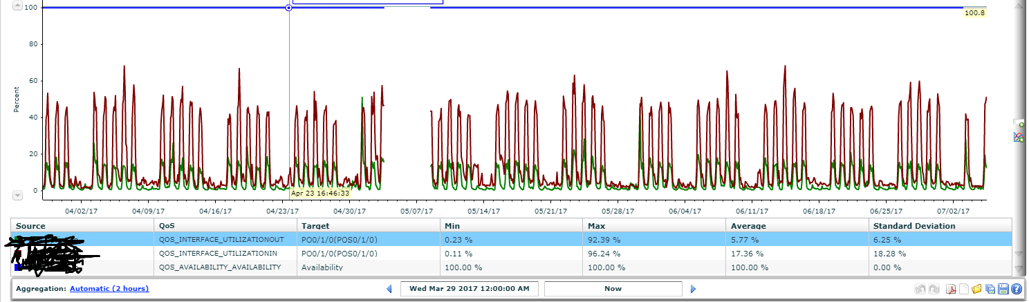
Below the actual graph it shows the Source, QOS, Target,...etc and Data points Max, Min, Etc.
This is very useful data but I need to be able to apply an operating period which I can only seem to be able to do in the SLM.
When I create a new SLA inside the SLM and than view the report I see the graph like below:
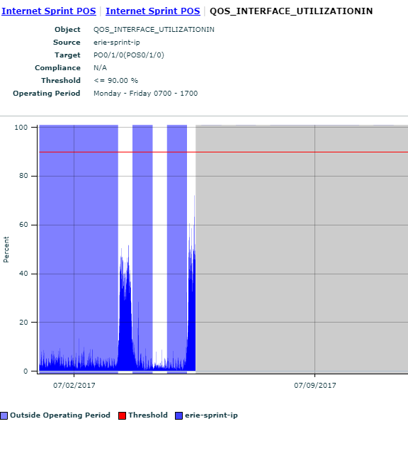
Which is great it applies the Operating period shows both sides inside and outside of the operating period but we would like to be able to see the data points like Min, Max, Peaks like we can above in the PRD. Is this possible in the SLM when creating an SLA somehow? Or is it possible to apply or set operating hours inside the PRD some how?