As some people are still new to HTML 5 Dashboard options in UIM, I wanted to give a brief example of using the Line Chart Widget.
First we will start with the Line Chart; this will provide you the ability to create a time series chart based on either a QOS metric or an SQL query. In this example I will be providing the SQL example.
Step 1 – Drag the Line Chart widget onto the dashboard canvas. This will leave give you a blank widget.

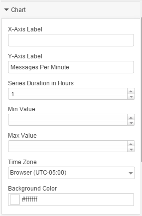
Step 2 – Configure the Chart
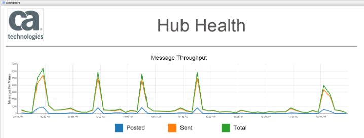
- Give it a Y-Axis Label. In my case that is Messages Per Minute
- Give it a Series Duration, I will be using 1 hour
Step 3 – Configure the Series
- Highlight the Line Chart widget on the canvas (will have a red border).
- Press the + icon under the Series navigation section on the right column.
- In the Series Data Source Type dropdown, select SQL.
- Press the + icon under the SQL data source to create the datasource.
- Give the Query a name, select the NIS option from the database dropdown.
- Paste and Test your query.
In this example I am returning the last hour with the following query:
select d.sampletime, d.samplevalue as posted from S_QOS_DATA s join RN_QOS_DATA_1730 d on s.table_id=d.table_id where s.target = 'WorldWideHQ' and d.sampletime > DATEADD(HOUR, -1, GETDATE())
I like to go back and rename the Series 1 that was created earlier, this will help if you are creating your own legend.
Repeat the steps required to create multiple series if needed.
NOTE: The format of the SQL query needs to return two columns, the first being the sampletime and the second being the value.
Step 4 – Create a custom legend. The current version of the dashboard does not have a legend associated with the Line Chart, so we will need to create one.
- Drag a Rectangle Widget onto the canvas underneath your Line Chart.
- Change the size to be appropriate to your Line Chart.
- Change the color to match the Series.
- Series 1: #1F77B4
- Series 2: #FF7F0E
- Series 3: #2CA02C
- Series 4: #D62728
- Series 5: #9467BD
- Series 6: #8C564B
- Give the Widget a Label to match the Series.
Clone the Rectangle Widget and repeat for each Series.