Recently I have completed a dashboard that I feel provides both technical and business users with a very high level overview of your Infrastructure that is managed by UIM. Not only does it have the Executive level information (SLAs, Health Index, Alarm State) but it also allows a more technical user to drill down into a more detailed set of data (USM, other dashboards, etc). The Scorecard also shows very well in a NOC environment on the projector or tv. You can download the Scorecard.zip file and import it into the HTML 5 Dashboard Designer.
THE DASHBOARD
---------------------------

As you can see there are different sets of information that each 'badge' contains.
- The numbered gauge is used to represent the health of the service or application.
- I prefer either an SLA or Health Index value.
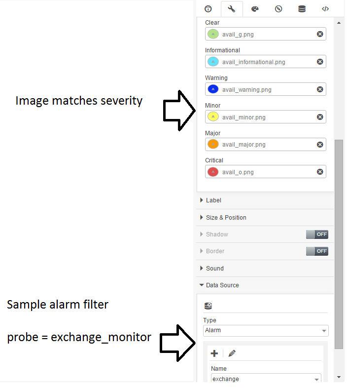
- The A icon represents the alarm status of the service or application.
- A simple alarm filter is best.
- The P icon represents a drill down dashboard (Some examples of these will follow in later posts).
- This could also just link to a Unified Dashboard or any other direct link in the UMP.
THE DATASOURCES
------------------------------

In order to make the dashboard generic I have created some simple SQL based datasources to be used at the time of import. These are just hard coded numbers that each query represents. You can just as easily select the SLA datasource that is appropriate for the service or application.
THE GAUGE
-----------------

THE ALARMS
-------------------
THE PERFORMANCE
------------------------------

Please let me know your thoughts on the dashboard and any ideas on improving it.
TO DO: I still need to make the different sections modular, currently its a fixed background.
Thanks,
Bryan